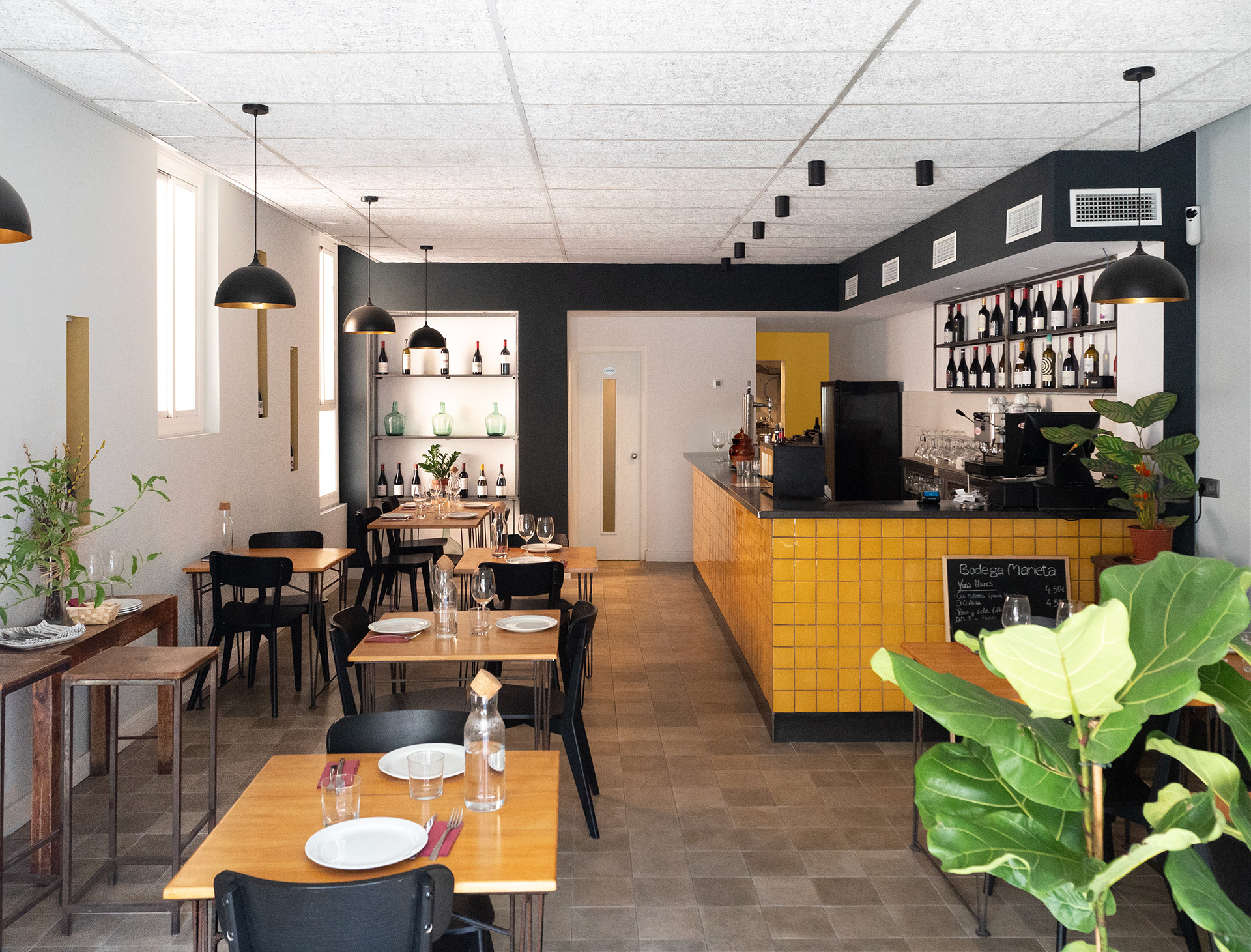
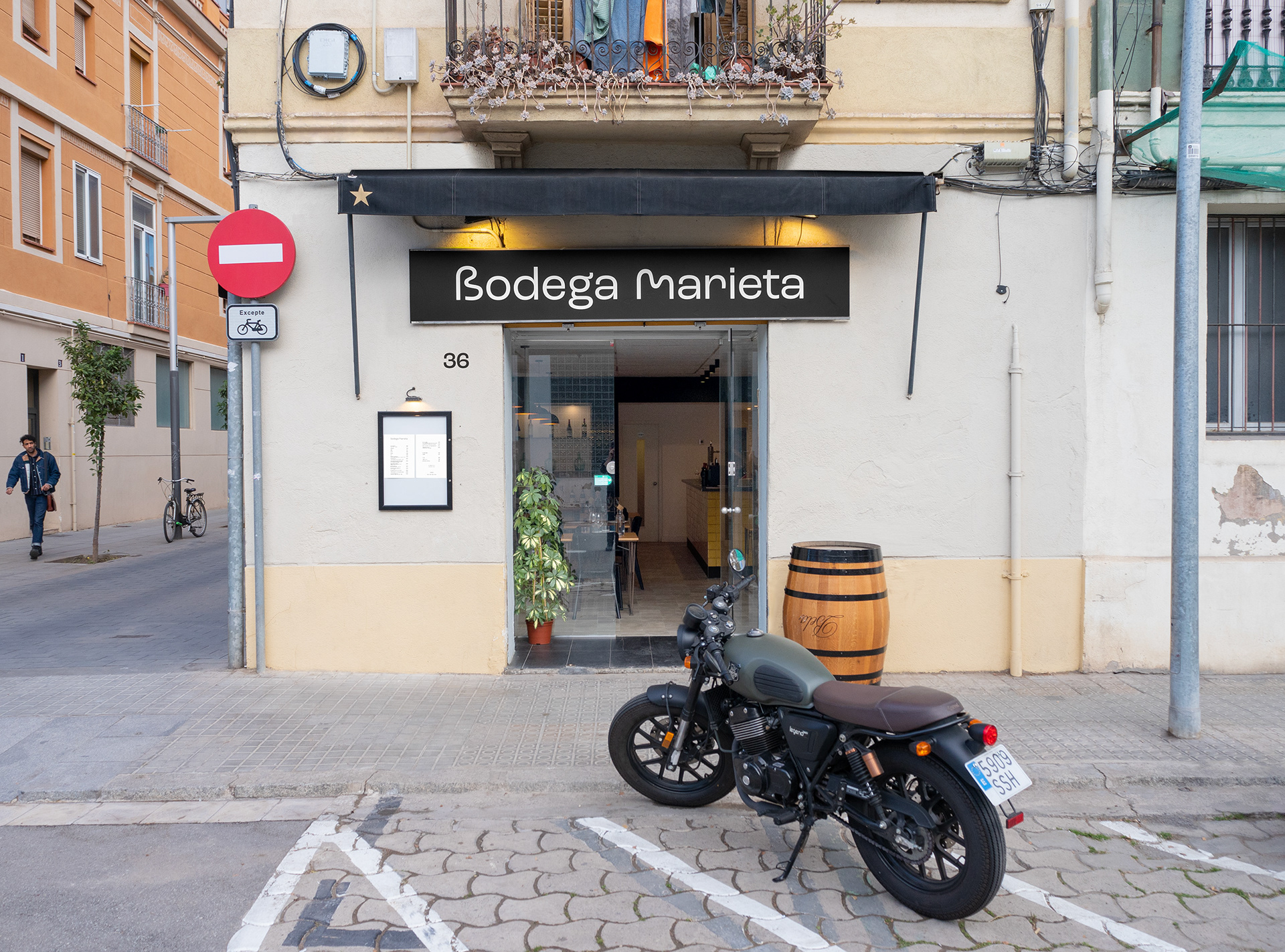
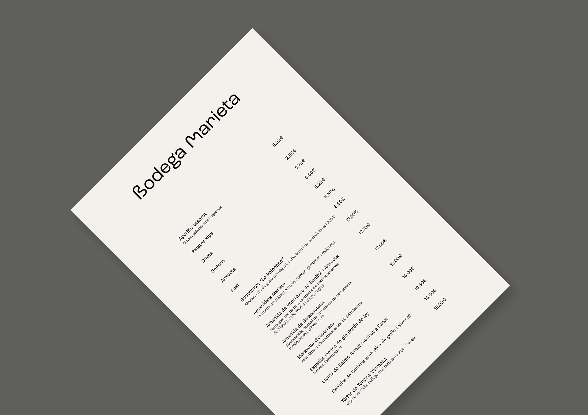
Carmen Costa commissioned me to create the visual identity of her new gastronomic project in the Poblenou neighbourhood. This place combines traditional product cuisine with some Mexican dishes and has a good selection of fine wines.
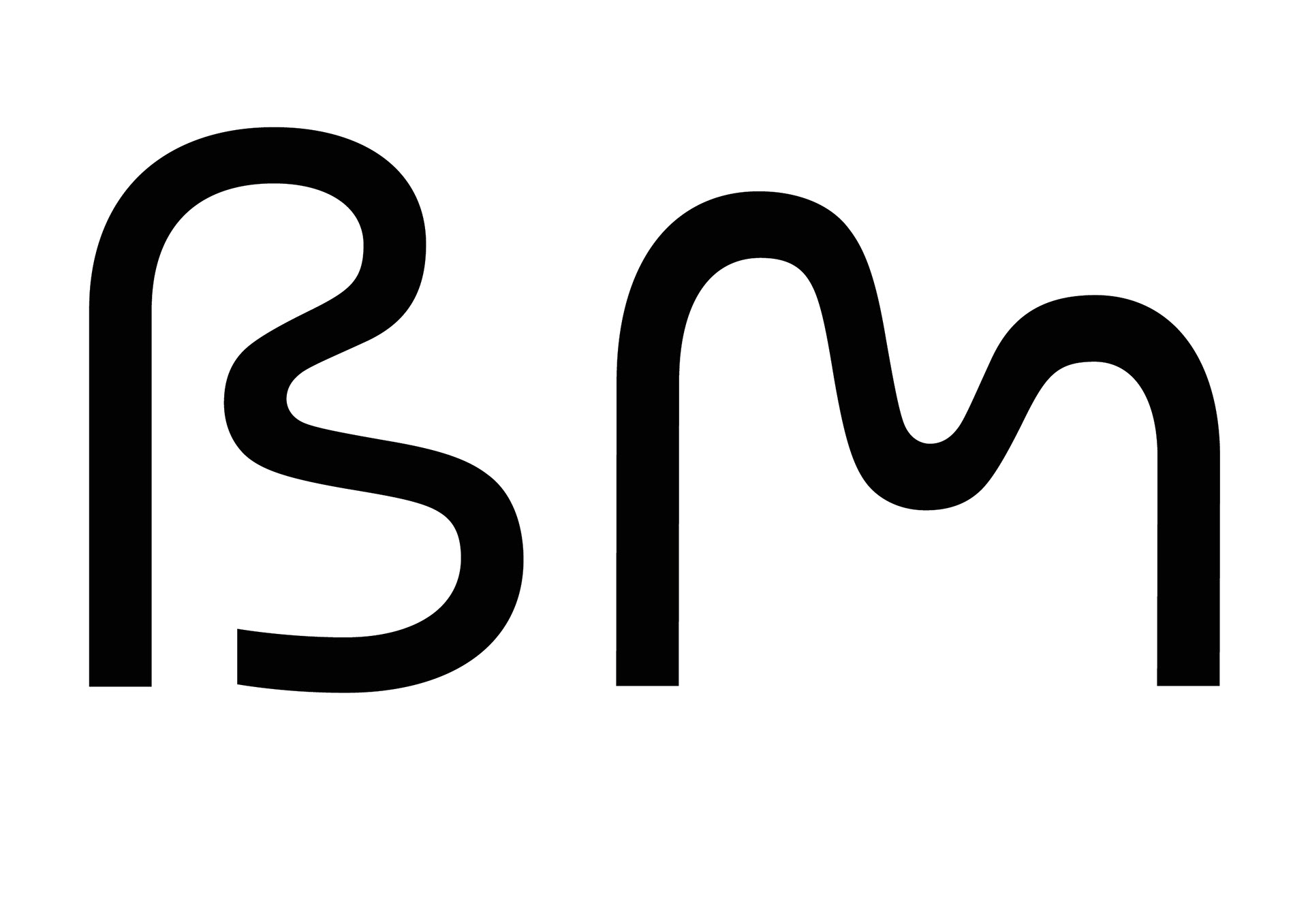
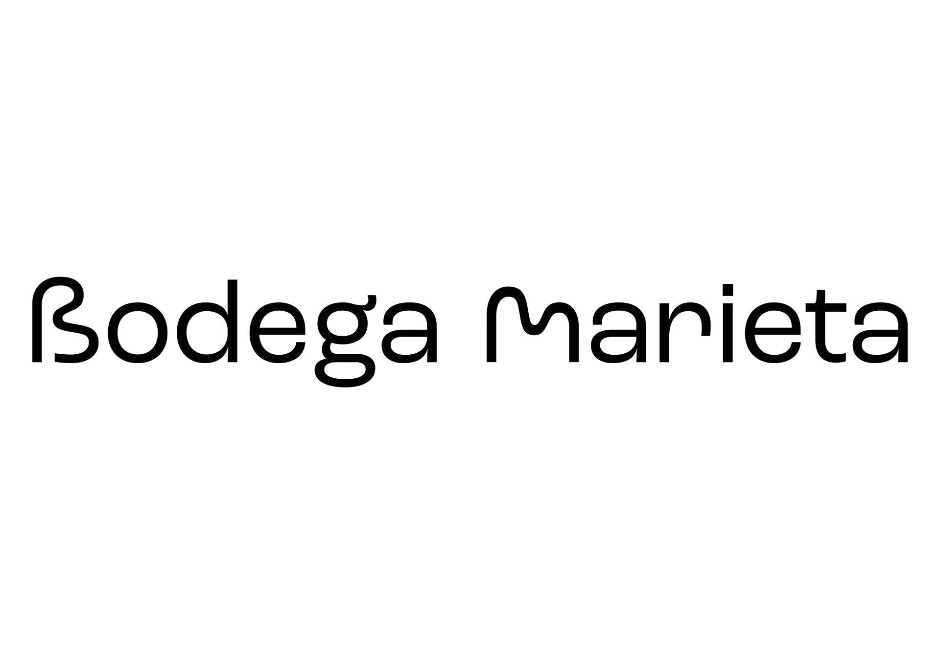
The goal of the visual identity was to make it attractive and feminine and create a pleasant environment where people would want to have a good time. To achieve this, I used the Beta letter of the Greek alphabet to give the B of Bodega a more fluid appearance and transformed B into M of Marieta.